Blog / Development
Dark mode illustrations: how to make SVGs work in both themes
Most illustrations are drawn for white pages. Drop one into a dark theme and you get a glowing rectangle or lines that vanish. Here are three ways to make illustrations look native in both themes, from simplest to most flexible.
By Abdullah NomanOctober 13, 20263 min read

Dark mode is no longer optional for SaaS products, and it is where illustrations most often look broken. There are two typical failures: a white background box that glows in the middle of a dark screen, and dark lines that disappear into the dark background. Both come from the same cause: the illustration's colours are fixed while the page around it changes.

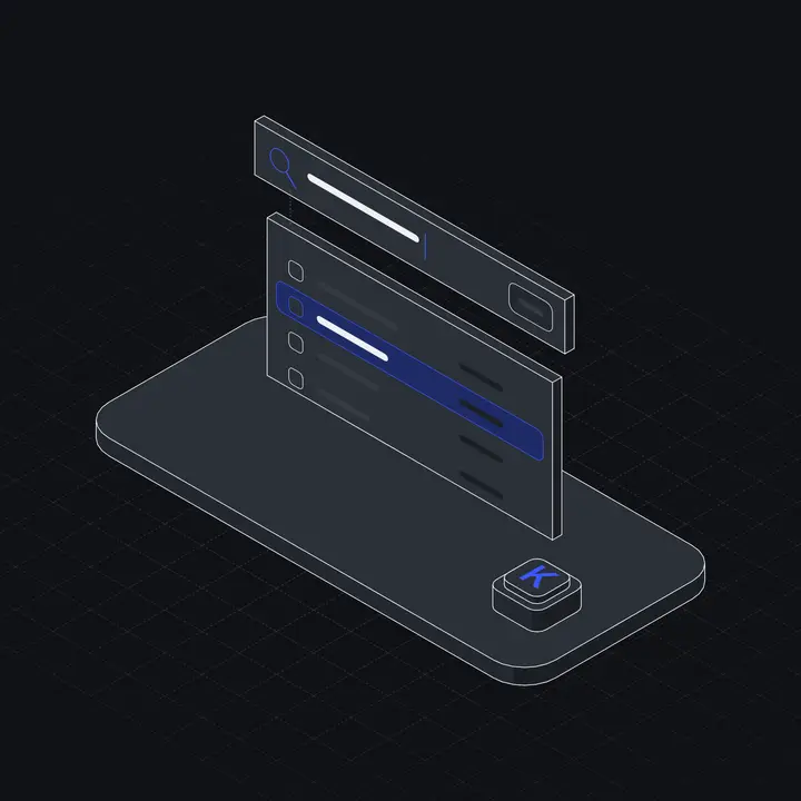
What "works in dark mode" actually means
Inverting colours is not enough. A good dark version changes several things at once:
- Lines go from near-black to near-white, but not pure white, which is harsh on dark grey.
- Surfaces (the faces of objects) become slightly lighter than the background, so objects still separate from it.
- Shadows and hatching get lower contrast, or they look like noise.
- The accent colour often needs to be a little lighter to keep enough contrast on dark.
- The background becomes transparent or matches the card it sits on.
Fix 1: two files, swap with the picture element
If your illustrations come with light and dark files, the browser can pick one based on the user's system setting, with no JavaScript:
<picture>
  <source srcset="/illustrations/command-palette-dark.svg"
          media="(prefers-color-scheme: dark)">
  <img src="/illustrations/command-palette-light.svg" alt="" width="240" height="240">
</picture>
Good: simple and fast. Limit: it follows the operating system, not an in-app theme toggle. If your app has its own light/dark switch, use fix 2 or 3.
Fix 2: two files, swap with your theme class
If your app sets a class or attribute on <html> (shadcn and Tailwind use .dark), render both images and show one:
<img class="block dark:hidden" src="/ill/inbox-light.svg" alt="" />
<img class="hidden dark:block" src="/ill/inbox-dark.svg"  alt="" />
The hidden one may still download, which is fine for a couple of small SVGs and wasteful for dozens of large PNGs.
Fix 3: one inline SVG that reads CSS variables
The most flexible approach is a single SVG whose colours are CSS variables with fallbacks:
<path class="s-ink" d="..." />

<style>
  .s-ink    { stroke: var(--hl-ink, #15171c); }
  .f-accent { fill:   var(--hl-accent, #3a57ff); }
</style>
Then your theme sets the variables once for every illustration on the page:
:root {
  --hl-ink: #15171c; --hl-surface-0: #ffffff; --hl-accent: #3a57ff;
}
.dark {
  --hl-ink: #eef0f3; --hl-surface-0: #2b3038; --hl-accent: #7c8cff;
}
Now theme toggles, brand colour changes and even per-section colour schemes all happen in CSS. The catch, again: this only works when the SVG is inline in the page (or rendered as a component). An <img> cannot read the page's variables. See SVG illustrations in React for the ways to inline them.
Colour tips for the dark version
- Use a line colour around
#E8EAEErather than pure white. - Make object surfaces two or three steps lighter than the background, so shapes still read.
- Check the accent against the dark background for contrast. Saturated blues and purples often need lightening.
- Drop drop-shadows. On dark backgrounds they look like smudges.
- Test on the real dark surface of your app, not on pure black.
Checklist
- No white box around illustrations in dark mode.
- Lines visible but not harsh.
- Theme toggle in the app switches illustrations too, not only the OS setting.
- Accent colour still matches the brand and has enough contrast.
Every Liniqo illustration has a light and a dark version, and the SVGs use CSS variables like --hl-ink and --hl-accent, so you can use fix 1, 2 or 3. The React components take theme="auto" and follow a .dark class automatically.
Questions
Why does my illustration have a white box in dark mode?
The SVG or PNG has a solid white background. Use a version with a transparent background, or a dark version of the file.
Can an img tag SVG follow my site theme?
Only through the prefers-color-scheme media query inside the SVG, which follows the OS setting, not your app toggle. To follow an in-app theme, inline the SVG or swap files.
Should I just invert the colours for dark mode?
No. Inverting turns accent colours into their opposites and makes surfaces too dark. Adjust lines, surfaces, accent and background separately.