Blog / UX patterns
Empty state illustrations: 8 patterns that make an app feel finished
An empty state is often the first screen a new user sees. A good one explains what goes here, why it is empty and what to do next. Here are the patterns that work and how illustration fits in.
By Abdullah NomanOctober 13, 20264 min read
Every list, table, inbox and dashboard in your product starts empty. For a new user that empty screen is not an edge case, it is the first impression. A blank table with "No data" says "something is broken". A clear empty state says "this is where your invoices will live, and here is how to add the first one".
The anatomy of a good empty state
Strong empty states have the same four parts, in this order:
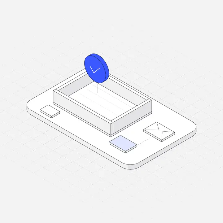
- A visual that signals the topic at a glance. An inbox tray for messages, a chart for reports, a box for orders.
- A short headline that says what this space is for, not that it is empty. "Your invoices will appear here" beats "No invoices".
- One sentence of help on why it is empty or what happens next.
- One primary action, ideally the exact action that fills the screen. Add a secondary link only if it truly helps, such as "Import from CSV".
8 kinds of empty state, with copy
1. First use
The user has never added anything. This is an onboarding moment, so be welcoming and specific. "Create your first project. Projects keep tasks, files and people for one piece of work together." Button: "New project".
2. User cleared it
Inbox zero, all tasks done. This is a reward, not a problem. "All caught up. New messages will show up here." No button needed.
3. No search results
Say what you searched and offer a way out. "No results for 'invoce'. Check the spelling or search all workspaces." Keep the illustration small here, because the user is mid-task.
4. Filters hide everything
Very common and often confusing. "No orders match these filters." Button: "Clear filters". Show which filters are active.
5. Waiting for data
Connected but nothing has arrived yet, for example analytics after installing a script. Tell people how long it usually takes and how to check the setup.
6. No permission
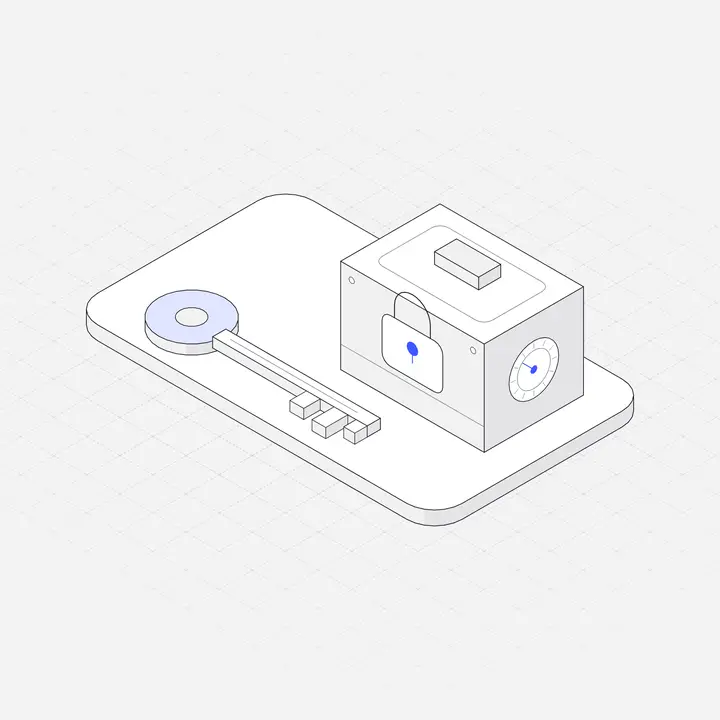
The content exists but this person cannot see it. Name who can grant access. An illustration of a lock or key works well here.
7. Feature not in plan
An upgrade prompt dressed as an empty state. Be honest and show what the feature does, not just a padlock.
8. Error
Something failed to load. This is not really empty, so say so: "We couldn't load your reports. Try again, or check our status page." Avoid cute illustrations here if the error might cost the user money or time.
How big should the illustration be?
Size it to the moment, not to fill space:
| Where | Suggested width | Why |
|---|---|---|
| Full page, first use | 200 to 280 px | A welcoming moment, but the button must stay above the fold |
| Inside a card or panel | 96 to 160 px | Signals the topic without crowding the card |
| Search or filter results | 64 to 96 px, or none | The user is mid-task; get out of the way |
| Mobile | About 40 to 55% of screen width | Leaves room for copy and a thumb-sized button |
Keep every empty state in one style
A product with fifteen empty states drawn by four different sources looks unfinished, even if each one is pretty. Pick one illustration style for all of them. Isometric object illustrations are a good fit because a single object, such as a tray, a folder or a chart, explains the topic without the extra noise of characters. If you need the background, we explain the style in What is isometric illustration?
Dark mode and colour
If your app has a dark theme, an illustration with a white background will glow like a hole in the screen. Use SVGs with a transparent background and a dark version, or SVGs that use CSS variables so their colours follow the theme. See Dark mode illustrations for the technique. Keep the accent colour to one part of the drawing, ideally the object the empty state is about.
Accessibility
- Empty state illustrations are usually decorative because the headline carries the meaning. Mark them that way:
alt=""on an<img>, oraria-hidden="true"on an inline SVG. - Make the headline a real heading, so screen reader users can find it.
- If you animate the illustration, keep it short and respect
prefers-reduced-motion.
<section class="empty">
  <img src="/illustrations/inbox-zero-tray.svg" alt="" width="200" height="200">
  <h2>All caught up</h2>
  <p>New messages will show up here.</p>
</section>
A quick checklist
- Does the headline say what this space is for?
- Is there exactly one obvious next step?
- Does the illustration match the topic and every other empty state?
- Does it look right in dark mode and on a phone?
- Is the image hidden from screen readers when it adds nothing?
Liniqo has illustrations for most of these moments, such as inboxes, empty frames, search, filters, locks and charts. Search the library for "empty" or browse the Mobile & UX Components pack.
Questions
What should an empty state include?
A visual that signals the topic, a headline that says what the space is for, one sentence of help, and one primary action that fills the screen.
Should every empty state have an illustration?
No. Use them for first-use and full-page states. For search results and filters, a small icon or plain text is often better because the user is in the middle of a task.
Should empty state illustrations have alt text?
Usually not. The headline carries the meaning, so mark the image as decorative with an empty alt attribute or aria-hidden.
How big should an empty state illustration be?
Roughly 200 to 280 px for a full-page first-use state, 96 to 160 px inside a card, and smaller or none for search and filter results.