Blog / UX patterns
How to use illustrations in SaaS onboarding
Onboarding has one job: get a new user to the moment the product clicks. Illustrations can make that path clearer and friendlier, or they can become decoration that people skip. Here is how to tell the difference.
By Abdullah NomanOctober 13, 20263 min read
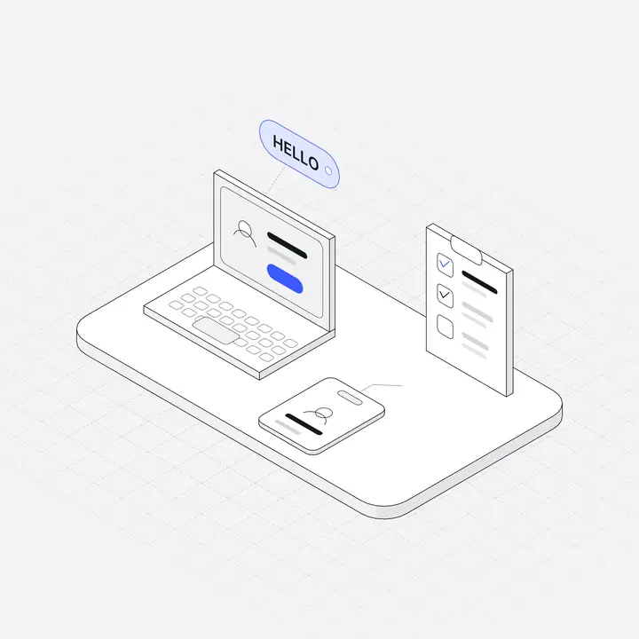
The best onboarding is short. Every screen between sign-up and the first useful result is a chance for someone to leave. So the question is never "where can we add illustrations?" but "where does a picture make the next step faster to understand?"
The rule: one idea per picture
An onboarding illustration should explain or set up exactly one idea: this step is about connecting your calendar, this one is about inviting your team. If you cannot say in five words what a picture tells the user, it is decoration, and decoration in onboarding costs attention you need for the actual task.
Five places illustrations earn their space
1. The welcome screen
The first screen after sign-up sets the tone. A single illustration that represents the product's core idea, next to a one-line promise and a clear "Get started" button, works better than a carousel of three marketing slides. People just signed up; they do not need to be sold again.
2. Setup steps
Multi-step setup (connect a data source, pick a template, invite people) benefits from a small illustration per step, because it lets people recognise where they are at a glance. Keep them small, about 120 to 160 px, beside or above the step title, and keep the form itself as the main thing on screen.
3. The checklist
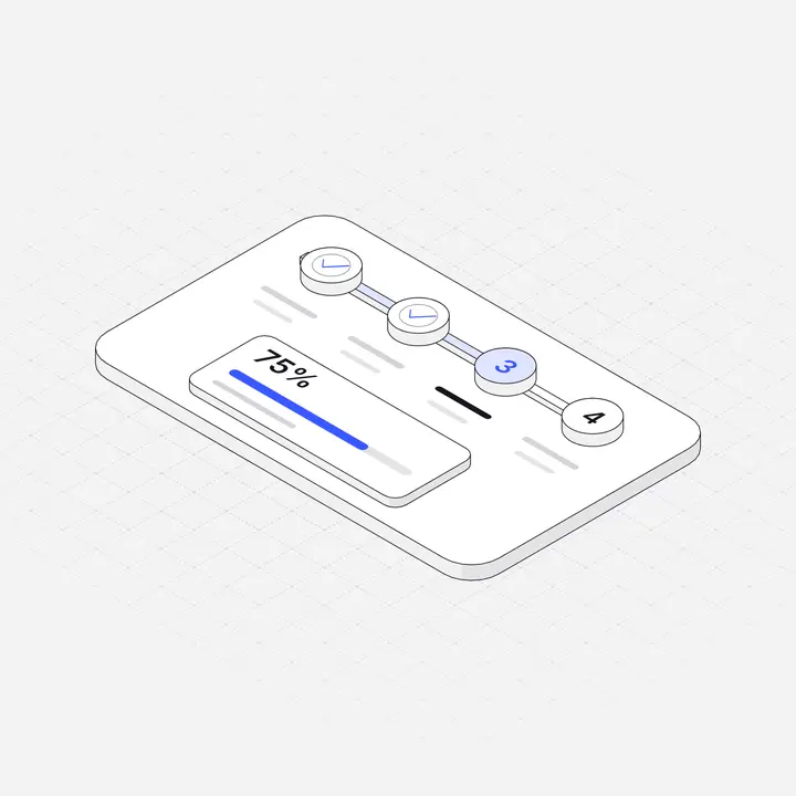
Persistent setup checklists ("4 of 6 done") are one of the most effective onboarding patterns in SaaS. An illustration at the top of the checklist panel makes it feel like a guided path rather than a to-do list. Do not add a picture to every item; the checkmarks are the visual.
4. Empty states
For many products the real onboarding happens in empty states: the first project, the first report, the first invoice. These deserve the most care, since they appear exactly when someone is trying to do the thing. We cover them in detail in Empty state illustrations.
5. The success moment
When someone finishes setup or reaches their first result, mark it. A short animated illustration, such as lines drawing on over half a second, makes the moment feel earned without a confetti explosion. See Animated SVG illustrations for a lightweight way to do it.
Where illustrations get in the way
- Product tours. Tooltips pointing at real UI should show the real UI. An illustration inside a tooltip pulls the eye away from the thing you are pointing at.
- Long forms. If a step has many fields, a large picture pushes the button below the fold on a laptop. Shrink or remove it.
- Carousels before sign-up. Three swipeable slides with big illustrations are skipped by most people. If the message matters, put it on the landing page.
- Mixed styles. A 3D welcome render, flat characters in the tour and isometric empty states feel like three products. Pick one style for the whole journey.
Practical tips
- Match the illustration to the step's noun. Calendar step, calendar object. Payments step, card terminal. It sounds obvious, but generic "person at laptop" art is the most common mistake.
- Use your brand accent on one part. If the illustration's accent colour matches your primary button, the eye moves from picture to action naturally.
- Design for dark mode from the start. Onboarding often happens late at night on a dark OS theme. See Dark mode illustrations.
- Keep files small. SVG is usually a few kilobytes and stays sharp at any size. Avoid large PNGs in the first screens, where load time matters most.
- Measure. If you add illustrations to a step, watch completion rate for that step. Pictures should make steps faster, not slower.
A simple onboarding illustration plan
| Screen | Illustration | Size |
|---|---|---|
| Welcome | The product's core object | 240 to 320 px |
| Each setup step | The step's noun (calendar, card, team) | 120 to 160 px |
| Checklist panel | One header illustration | 80 to 120 px |
| First empty states | The thing that will appear there | 160 to 240 px |
| Setup complete | A short draw-on animation | 200 to 280 px |
Liniqo's Mobile & UX Components and SaaS Dashboard Panels packs include onboarding steppers, checklists and carousels drawn in the same style as the rest of the library, so welcome screens, steps and empty states match.
Questions
Do illustrations improve onboarding?
They help when each one explains a single step or idea and keeps the main action visible. They hurt when they are large decoration that pushes buttons below the fold.
How many illustrations should onboarding have?
Usually one for the welcome screen, a small one per setup step, and one for the success moment. Keep the style identical across all of them.
Should onboarding illustrations be animated?
A short animation on the success moment works well. Avoid looping animations on steps where people need to read or type, and respect reduced-motion settings.