Blog / Design
How to use illustrations on a SaaS landing page without looking generic
Illustrations can make a landing page clearer, or they can make it look like every other startup template. The difference is mostly about where you use them and how specific they are to your product.
By Abdullah NomanOctober 13, 20263 min read
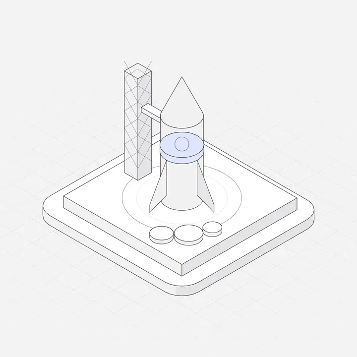
Visitors decide in seconds whether a page is for them. Illustrations help when they make the product's idea faster to understand. They hurt when they are the same rocket-and-laptop picture every other page uses. Here is a section-by-section approach.
First: product screenshot or illustration?
If your product has a clear, good-looking interface, a real screenshot is usually the strongest hero image, because it shows exactly what people get. Illustrations are better when:
- the product is mostly invisible (an API, infrastructure, background automation),
- the UI is early and changing every week,
- you need to explain a concept, like how data moves between systems,
- or you want to show several features in a uniform way.
Many good pages use both: a screenshot in the hero, illustrations for features and explanations.
Section by section
Hero
If you use an illustration here, make it about your product's core object, not about "growth" or "launch". A payroll tool gets a payslip and a calendar; a monitoring tool gets a server and an alert. Size it so the headline and the main button stay above the fold on a 13-inch laptop.
Feature grid
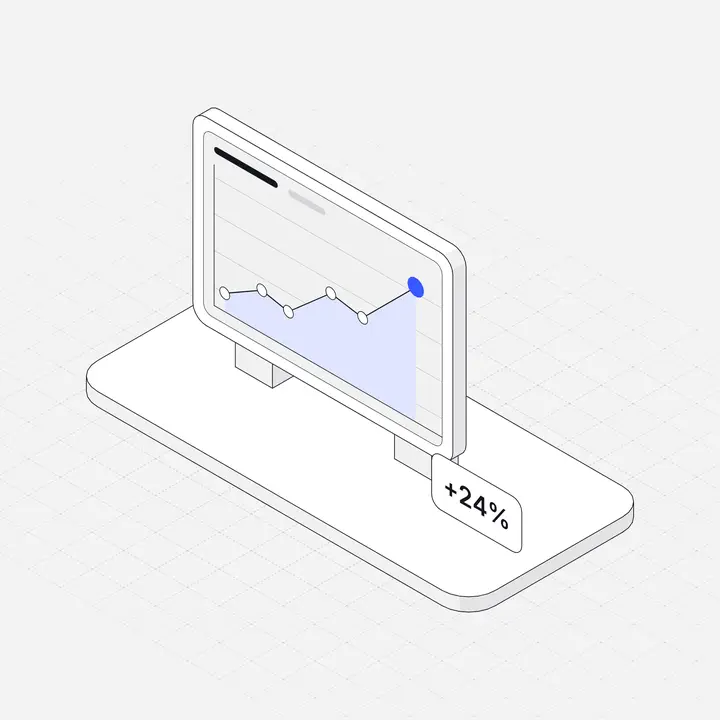
This is where illustrations do the most work. Give each feature card one small object that names the feature at a glance. Same size, same style, same accent colour on each. Uniformity is what makes a grid look designed instead of collected.
How it works
Three steps, one illustration each, connected by a line or arrow. Isometric scenes are especially good here because pieces on the same grid can be shown side by side as a flow. See What is isometric illustration?
Integrations and security
Security sections benefit from one calm illustration (a shield, a lock, a server) next to concrete facts like encryption, SSO and compliance. The facts sell; the picture makes the section easy to find while scrolling.
Pricing and FAQ
Usually leave these clean. A small illustration per plan can help if plans differ in kind (solo vs team vs enterprise), but never let it push prices below the fold.
Seven ways to avoid looking generic
- Be literal about your product. Draw your nouns: invoices, shipments, patients, deployments.
- Use one style across the whole page, and the app too, so signing up does not feel like entering a different product.
- Recolour to your brand. The default library colour is the giveaway that you used a library. See How to recolour SVG illustrations.
- Combine pieces. Put two or three objects into one scene for your hero. That scene exists nowhere else.
- Show real data in the picture. A chart illustration with your product's real metric label beats a generic one.
- Animate one thing. A single draw-on animation in the hero catches the eye. Ten animations distract. See Animated SVG illustrations.
- Cut the ones that do not explain anything. If removing an illustration loses no meaning, remove it.
Technical checklist
- Use SVG for illustrations; it stays sharp on retina screens and is usually tiny.
- Set width and height on every image to prevent layout shift (a Core Web Vitals factor).
- Lazy-load everything below the hero.
- Write useful
alttext for meaningful illustrations, and empty alt for decorative ones. - Check both light and dark themes if your site has them.
See it in practice
Our showcase has landing pages and app screens built with Liniqo illustrations, recoloured to different brands, which is a quick way to judge whether an isometric style suits your product before you design anything.
Questions
Should a SaaS landing page use illustrations or screenshots?
Use a screenshot when your UI is clear and stable. Use illustrations for invisible products, early UIs, concepts and uniform feature sections. Many pages use both.
How do I make stock illustrations look unique?
Recolour them to your brand, combine several into one scene, show your product's real nouns and data, and use one style everywhere.
Do illustrations slow down a landing page?
SVG illustrations are usually a few kilobytes. Large PNGs and many animations can slow a page. Set sizes, lazy-load below the fold and keep animation to one or two places.