Blog / Guides
What is isometric illustration? A practical guide for product teams
Isometric illustration draws three-dimensional things on a flat grid where nothing shrinks with distance. Here is how it works, why so many software products use it, and what to look for before you pick a style.
By Abdullah NomanOctober 13, 20264 min read
Open the marketing site of almost any cloud, data or developer tool and you will see the same kind of picture: a server rack, a dashboard or a stack of database cylinders, drawn at an angle, with clean lines and no perspective. That is isometric illustration. It has become the default visual language for software that wants to look precise without looking cold.
The short definition
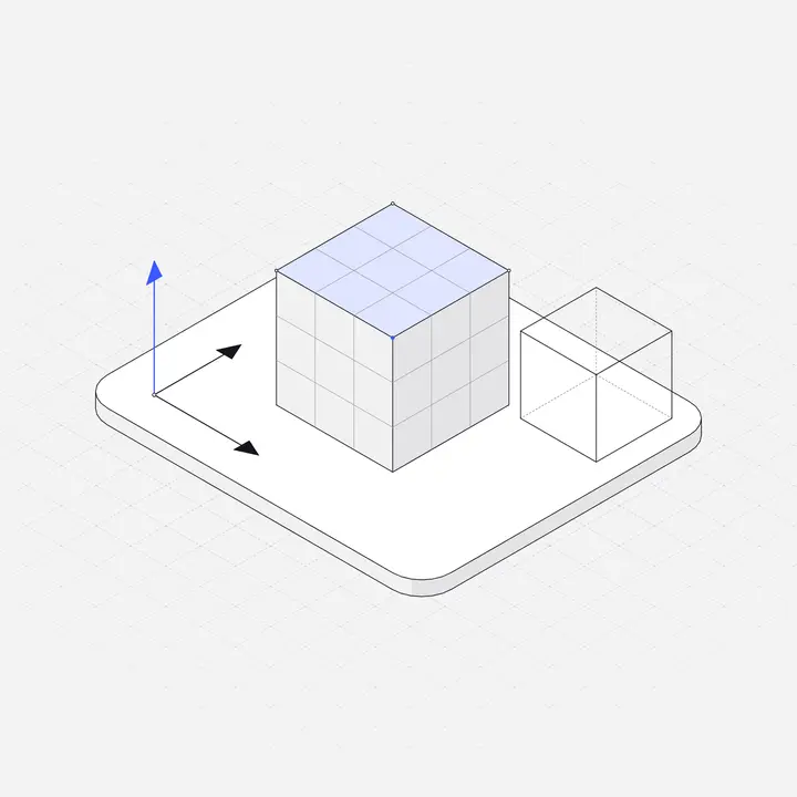
An isometric illustration shows a 3D object using three axes that sit 120 degrees apart on the page. Width and depth run along lines tilted 30 degrees from the horizontal, and height runs straight up. Because the three axes are drawn at the same scale, an object at the back of a scene is exactly as large as the same object at the front. There is no vanishing point.
The word comes from Greek: isos (equal) and metron (measure). The "equal measure" is the point. Every edge that is the same length in real life is the same length in the drawing, which is why engineers used isometric projection for technical drawings long before designers used it for landing pages.
Isometric vs perspective vs flat
| Flat | Perspective | Isometric | |
|---|---|---|---|
| Depth | None, everything is front-on | Real depth, things shrink with distance | Depth shown, but nothing shrinks |
| Feel | Friendly, simple | Realistic, cinematic | Technical, tidy, "systems" |
| Easy to combine pieces? | Yes | Hard, every scene has its own camera | Yes, every piece shares one grid |
| Good for | Characters, simple concepts | Hero renders, product shots | Software, infrastructure, processes, objects |
The last two rows explain the popularity in software. Because every isometric piece is drawn on the same grid, you can put a laptop next to a database next to a phone and they look like they belong in the same room. With perspective drawings, each one would have its own camera angle and they would clash.
Why software products use it
- It shows systems. Software is invisible. Isometric scenes turn abstract ideas like "data flows from your app to the warehouse" into objects connected by lines, which is easier to grasp than a paragraph.
- It reads as precise. The strict grid gives a measured, engineered feeling that suits products sold on reliability.
- It scales from icon to hero. A single isometric object works at 64 pixels in an empty state and at 800 pixels in a landing page hero.
- It avoids the people problem. Character illustrations raise questions about representation, age and style that are hard to get right across a whole product. Objects and devices sidestep that, and they do not date as quickly.
True isometric vs the "2:1" pixel version
Strict isometric uses 30-degree lines. Pixel artists and many digital illustrators use a slightly flatter angle of about 26.57 degrees, because it gives a clean two-pixels-across, one-pixel-up staircase. That variant is technically dimetric, but most people still call it isometric. For vector illustration either works. What matters is that every piece in your product uses the same angle. Mixing the two is one of the quickest ways to make a set of illustrations look off without anyone being able to say why.
What makes an isometric style consistent
If you are choosing a library or briefing an illustrator, check these five things across at least ten pieces, not just the hero image:
- Angle. One grid, every time.
- Stroke weight. Lines should be the same width at the same size. A library where some pieces use 1px lines and others 3px will look patched together.
- Light direction. The same faces should be light or shaded in every piece.
- Level of detail. A very detailed server rack next to a three-line coffee cup looks like two artists.
- Colour logic. Ideally one accent colour used for "the important part", and neutrals for everything else, so you can swap the accent for your brand.
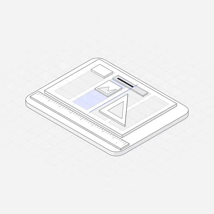
Where isometric illustrations work best in a product
- Empty states, where a calm object explains what will appear. See our guide to empty states.
- Feature sections on a landing page, one object per feature.
- Onboarding steps, where a small scene sets up each step.
- Docs and changelogs, to break up long text with something that signals the topic.
- Error and 404 pages, where a gentle object softens the moment.
They work less well for emotional moments that need a human face, such as a welcome from a founder or a support conversation. That is fine: use a photo there and keep illustrations for explaining things.
How to start without drawing it yourself
Drawing isometric art by hand is slow, even with grid tools in Figma or Illustrator. Most product teams use a library and adjust colours to their brand. When you compare libraries, look for one consistent style across the whole set, SVG files you can recolour, and dark versions if your product has a dark theme. We compared the main options in Best isometric illustration libraries.
Liniqo is one of them, so take this with that in mind: it is 2,049 hairline isometric illustrations drawn on one grid with one stroke weight, with light and dark versions and an accent colour you can change. You can browse the free ones to see whether the style fits.
Questions
Is isometric the same as 3D?
No. Isometric is a 2D drawing method that represents 3D objects. There is no camera and no perspective, so it is usually lighter, sharper and easier to edit than a 3D render.
What angle is isometric?
True isometric uses lines at 30 degrees from the horizontal, so the three axes are 120 degrees apart. A common digital variant uses about 26.57 degrees (a 2:1 pixel ratio).
Are isometric illustrations still in style?
Yes for software, data and infrastructure products, because they explain systems clearly. Thin-line versions look more current than the heavy, gradient-filled style that was common a few years ago.
Can I make isometric illustrations in Figma?
Yes, with an isometric grid plugin or by rotating and skewing shapes, but it is slow for a full set. Most teams start from a library and recolour it.