Blog / UX patterns
Interactive empty states and onboarding: small moments that respond
Empty states and onboarding screens are the quietest moments in a product. Nothing is loading, nothing is listed, and the user is deciding what to do next. A small illustration that responds to them can make that moment feel cared for. Here is how to do it without getting in the way.
By Abdullah NomanOctober 16, 20263 min read
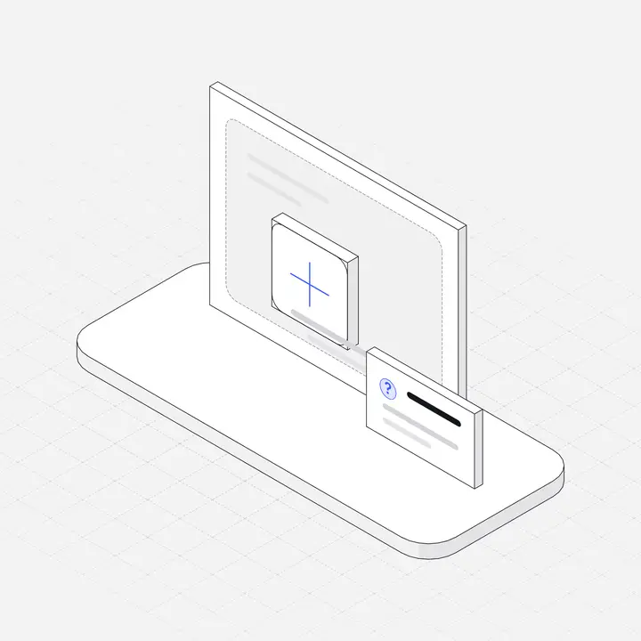
We have written about the structure of good empty states and where pictures help in onboarding. This guide is about one extra layer: making the illustration in those moments respond when the user moves towards it.
Why these screens suit interaction
- Nothing else is moving. On a busy dashboard, motion competes with data. On an empty screen, a figure that responds is the only thing that does.
- The user is about to act. The pointer is already travelling towards the main button. An illustration near it will be passed over naturally.
- First impressions are made here. A new user's first projects page, inbox or orders list is empty by definition.
Micro-interactions, briefly
Dan Saffer's book Microinteractions breaks every small interaction into four parts: a trigger, rules, feedback, and loops and modes. Supademo's roundup of micro-interaction examples summarises it and includes Trello's empty board as an example of an empty state that makes the next step obvious. For an interactive illustration in an empty state:
- Trigger: the pointer moving over the figure, or a finger dragging across it.
- Rules: the part nearest the pointer responds most, its neighbours less.
- Feedback: the lift, the opening flap, the growing bar.
- Loops and modes: it returns to rest when the pointer leaves, and stays still when nobody is near it.
Match the figure to the screen
The illustration should show the thing that will fill the screen, and its response should hint at the action. Some pairings from the 23 free Liniqo Live figures:
| Empty screen | Figure | What it does |
|---|---|---|
| No orders yet | parcels | The parcel under the pointer lifts and opens its flaps |
| No bookings or events | calendar | The day under the pointer lifts, and its week rises after it |
| No appointments | appointment-board | Slots near the pointer push out from the board |
| No budgets | budget-envelopes | The envelope under the pointer rises and opens |
| No backups | backup-drives | The drive under the pointer rises out of its slot |
| No builds or deploys | ci-pipeline | The gates up to the pointer's stage lift and the build slides through |
| No activity log | audit-log | The ledger's pages leaf over as the pointer scrubs across |
| No settings changed | toggles | The switch under the pointer flips |
Code: an empty state with a live figure
<section class="empty">
  <div class="empty-art" data-liniqo="parcels" data-accent="#2563eb" aria-hidden="true"></div>
  <h2>Your orders will appear here</h2>
  <p>When a customer checks out, the order shows up in this list.</p>
  <a class="button" href="/products/new">Add your first product</a>
</section>

<style>
  .empty { display: grid; justify-items: center; text-align: center; gap: 12px; padding: 48px 16px; }
  .empty-art { width: 100%; max-width: 280px; aspect-ratio: 5 / 4; }
</style>
Keep the figure at about the size a still empty-state illustration would be, 200 to 280 px wide, and mark it decorative: the headline carries the meaning.
Onboarding
- Welcome screen: one figure that represents the product's core object, beside the "Get started" button. This is the best place for a larger interactive figure.
- Setup steps: keep these still. People are reading and typing, and motion next to a form pulls attention away from it.
- Success screen: a figure that responds is a quiet reward for finishing setup, without confetti.
- Checklists: the checkmarks are the feedback; no figure needed per item.
Rules that keep it helpful
- One responsive figure per screen.
- Never next to a form or an error message.
- The button comes first. On a laptop and on a phone, the main action must be visible without scrolling.
- The resting state must look complete, because many users will never hover. See Hover effects on mobile.
- Respect reduced motion. See Accessible interactive illustrations.
- Match dark mode. Pass
data-theme="dark"and your dark background asdata-bg, or let the figure follow adarkclass on a parent element.
What to measure
Delight is hard to measure; outcomes are not. When you add a responsive figure to an empty state, watch the click-through rate on its primary button and the time to first action. If either drops, the figure is pulling attention from the task and should be smaller, stiller or gone.
Find a figure for each of your empty states in the interactive library, filtered by category. 23 are free; all 500 come with Pro and Lifetime.
Questions
Should empty states be animated or interactive?
They can be, if the illustration stays small, the main button stays visible, and the resting state looks complete without interaction. One responsive figure per screen is enough.
What is a micro-interaction?
A small, single-purpose interaction made of a trigger, rules, feedback, and loops and modes, a framework from Dan Saffer's book Microinteractions.
Where should interactive illustrations go in onboarding?
On the welcome screen and the success screen. Keep setup steps with forms still, so people can focus on the fields.
How big should an interactive empty-state illustration be?
About the same as a still one: 200 to 280 px wide for a full-page empty state, smaller inside cards.