Blog / Design
How to build an interactive hero section that stays fast
The hero is where visitors decide whether to keep reading, and it is also where they move the pointer around the most. An illustration that responds can make that first screen memorable. It can also bury your headline and slow the page. Here is how to get the first without the second.
By Abdullah NomanOctober 16, 20263 min read
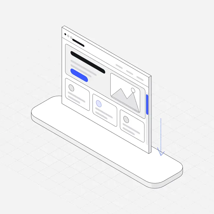
A hero section has one job: say what the product is and get the right people to the next step. Everything in it, including the illustration, should serve that. An interactive visual works when it makes the promise easier to believe or more memorable. It fails when it becomes the thing people look at instead of the headline.
What the hero must still do
- Headline that says what the product does, readable in two seconds.
- One line of support: for whom, or the main outcome.
- One primary button, plus at most one secondary link.
- A visual that shows the product, the outcome or the idea.
The interactive illustration replaces the last item. It should never push the first three below the fold on a laptop.
What the illustration should show
The best hero visuals are specific. A payments product shows coins or a ledger; a developer tool shows a pipeline or edge nodes; a scheduling app shows a calendar. When the interaction matches the subject, it explains something: the stage under the pointer opens, the coin stacks grow where you point, the day under the cursor lifts with its week.
Generic motion (floating blobs, particles that follow the mouse) is decoration. It can look nice, but it does not tell anyone what you sell.
Layout
| Layout | Works when | Watch out for |
|---|---|---|
| Text left, figure right | Most SaaS heroes; the eye reads the headline first | On phones the figure stacks below; keep it short |
| Text centred, figure below | A short headline and a wide, calm figure | The figure may fall below the fold; that is fine if the button is above it |
| Figure behind text | Rarely | Interaction under text competes with reading and can break text selection |
A copy-paste example
A two-column hero with a Liniqo Live figure on the right. The figure box keeps a 5:4 shape, so nothing jumps when it loads:
<section class="hero">
  <div class="copy">
    <h1>Ship isolated test environments in seconds</h1>
    <p>Every pull request gets its own sandbox. No queue, no shared state.</p>
    <a class="button" href="/signup">Start free</a>
  </div>
  <div class="art" data-liniqo="sandbox" data-accent="#7c3aed" data-bg="#ffffff"></div>
</section>
<script src="https://liniqo.com/live/embed.js" async></script>

<style>
  .hero { display: grid; grid-template-columns: 1.1fr 1fr; gap: 48px; align-items: center; }
  .art  { width: 100%; max-width: 520px; aspect-ratio: 5 / 4; }
  @media (max-width: 760px) {
    .hero { grid-template-columns: 1fr; }
    .art  { max-width: 360px; margin-inline: auto; }
  }
</style>
Set data-bg to the hero's background colour so the figure sits on it seamlessly, and data-accent to your primary button colour so the eye travels from picture to action.
Keep the hero fast
- Text first. The headline should be the largest thing that paints, not the illustration. Do not hide the hero until a script has loaded.
- Reserve the space. Give the figure's box a fixed aspect ratio, as above, so the layout does not shift when it appears.
- Load scripts async. A hero visual should never block rendering.
- Be careful with 3D. A WebGL scene in the hero means a runtime plus models on the most important screen. If you use one, show a static image first and swap it in later.
More detail in Interactive graphics without slowing your site.
On phones
There is no hover on a touch screen, so the figure's resting state is what most phone visitors see. Make sure it looks finished on its own. Liniqo Live figures respond to a finger dragged across them, and vertical scrolling still goes to the page. See Hover effects on mobile.
Checklist
- Headline, line of support and button are visible without scrolling on a 1366 × 768 laptop.
- The illustration shows your product's subject, not generic motion.
- The resting state looks complete without any interaction.
- The figure box has a fixed aspect ratio; nothing shifts as it loads.
- Its accent matches the primary button.
- It respects reduced-motion settings.
Browse the interactive figures by category (AI, SaaS, fintech, e-commerce, developer tools, healthcare and more) to find one that matches your product. 23 are free; the full set is on Pro and Lifetime. For still illustrations on the rest of the page, see SaaS landing page illustrations.
Questions
What makes a good interactive hero section?
A clear headline and button that are visible first, plus a visual whose interaction matches the product's subject. The resting state should look finished, and the page should not wait for the visual to load.
Do interactive heroes hurt page speed?
They can if a heavy script or 3D scene loads before the text. Small SVG-based figures loaded with an async script and a reserved box have little effect.
Should the hero illustration be interactive on mobile?
It can respond to touch, but most phone visitors will only see its resting state, so design that state first.
How big should a hero illustration be?
Usually 360 to 560 px wide on desktop, smaller than the headline column, and around 300 to 360 px on phones so the button stays near the top.