Blog / Pages
Pricing page design: a checklist for SaaS
A pricing page is read by people who are already interested. Its job is to remove doubt fast: which plan, what it costs, and what happens if it is the wrong one.
By Abdullah NomanNovember 5, 20263 min read
Short answer: show two to four plans side by side, mark one as recommended, put the price and the one thing that separates each plan at the top of its card, and answer refunds, cancellation and limits on the same page. Everything else (the full feature table, FAQ, logos) goes below for the people who need it.
How many plans should a pricing page have?
Three is the common choice because it gives a clear middle option. Two works when your audience splits cleanly (individuals and teams). Four is the practical maximum on one row. If you sell custom contracts, make that a line under the cards ("Need more? Talk to us") rather than a fourth column with no price.
What goes on each plan card?
- Plan name that says who it is for, not a metal.
- Price, with the billing period beside it.
- One line of difference: the limit or feature that makes someone choose it.
- Four to six features, starting with "Everything in the plan before, plus".
- One button, with a specific label such as "Start Pro".
Should you show monthly or yearly prices first?
Show the billing most of your customers pick, and put a toggle beside it. When the yearly discount is the default, say so clearly: "billed yearly" next to the price, and the monthly equivalent in smaller text. Hiding the billing period is the fastest way to lose trust at checkout.
Do you need a comparison table?
Yes, below the cards. Buyers who compare plans carefully want every limit in one place, and the table keeps the cards short. Group rows by topic, use ticks and plain numbers, and repeat the plan buttons at the bottom so nobody has to scroll back up.
Which questions should the pricing page answer?
- Can I cancel, and what happens to my work if I do?
- Is there a refund, and for how long?
- What counts towards a limit (seats, projects, downloads)?
- Do prices include tax, and which currencies do you charge in?
- Is there a discount for students, non-profits or teams?
Put these in an FAQ under the table. They are also the questions people ask search engines and AI assistants, so plain written answers help you show up for them.
Should a pricing page have illustrations?
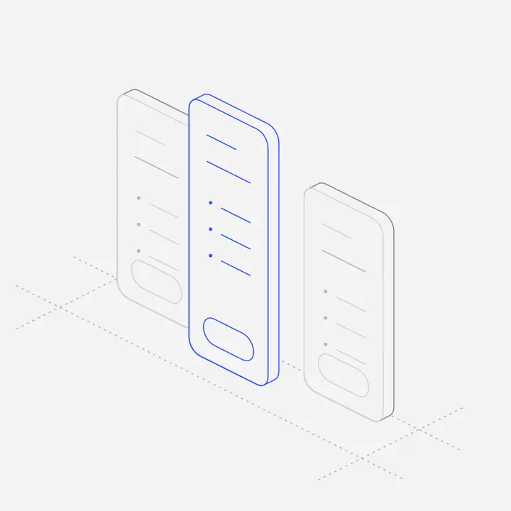
One, small and calm, is enough: a figure in the header or beside the FAQ makes the page feel like part of the product. Avoid illustrations inside the plan cards, where they compete with the price.
Where can you get a ready-made pricing page?
Liniqo’s pre-built pages include six pricing pages with a hairline figure already in place, in your brand colour and product name. Copy one as HTML or React, or ask your AI coding tool to fetch it through the MCP server.
Questions
How many pricing tiers should a SaaS have?
Usually three, with the middle one recommended. Two works for a clean split between individuals and teams; more than four becomes hard to compare.
Should prices be shown monthly or yearly?
Show what most customers choose, with a toggle, and always say how the plan is billed next to the price.
What should a pricing page FAQ include?
Cancellation, refunds, what counts towards limits, taxes and currencies, and any discounts.
Is a free plan or a free trial better?
It depends on how quickly people see value. If the product proves itself in minutes, a free plan works; if it needs setup, a time-limited trial with full features usually converts better.