Blog / Guides
Graphics for websites: 7 types and when to use each
"Website graphics" covers everything from a 16 px icon to a full-screen hero. Each type has a job it does best. Here are the seven you will use, how to pick between them and how to keep them looking like one brand.
By Abdullah NomanOctober 13, 20263 min read
Good websites rarely use more graphics than average. They use the right type for each job and keep every type in the same visual language. Here are the seven types, what they are for and the format to ship them in.
1. Icons
Job: label actions and items in tiny space. Format: SVG, usually an icon set or icon font. Tip: match stroke weight and corner style to your typography, and never use an icon without a label for an unfamiliar action.
2. Illustrations
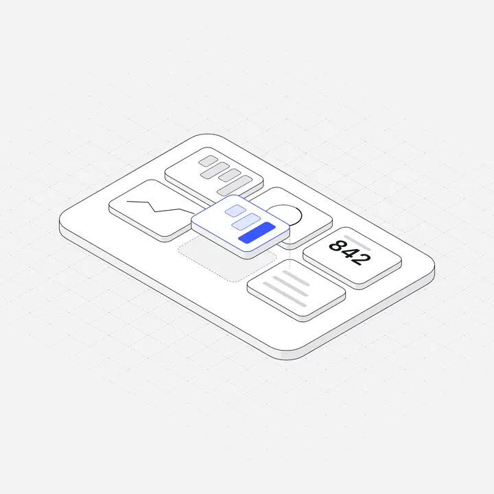
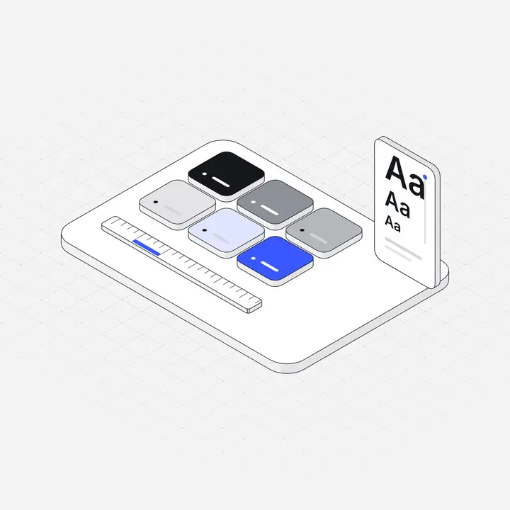
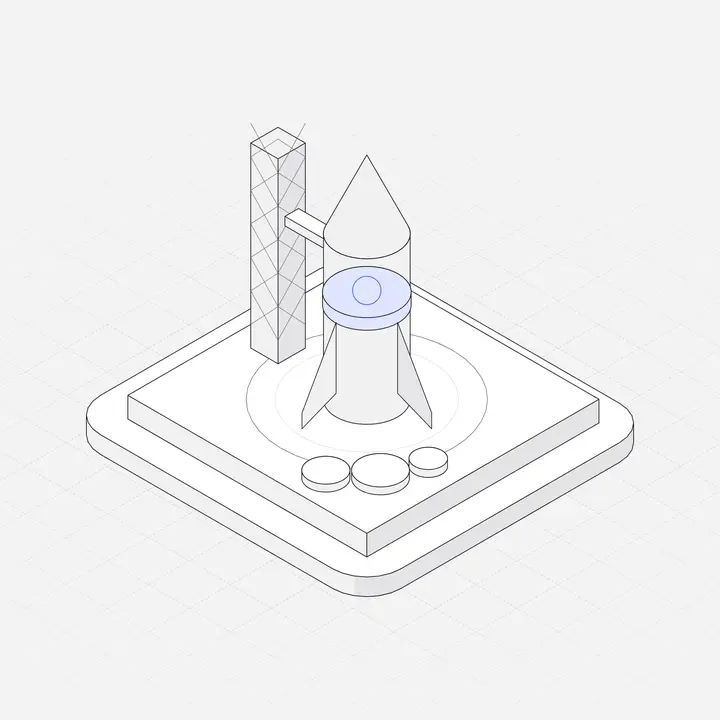
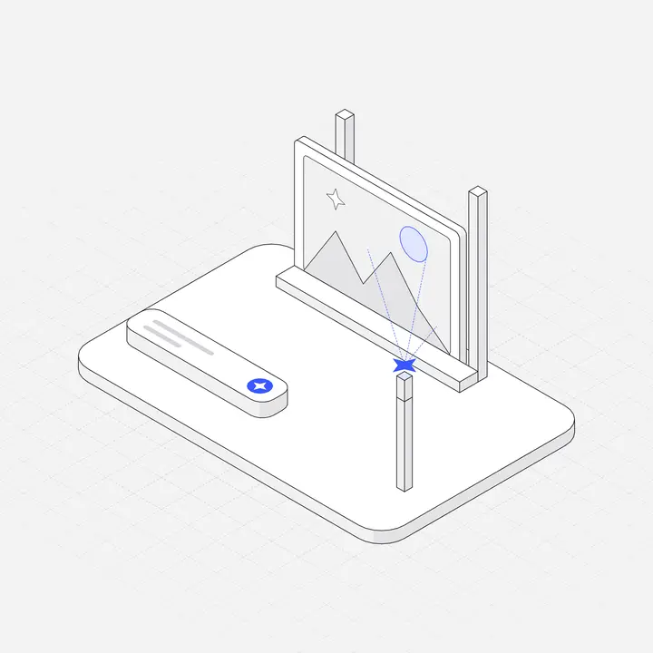
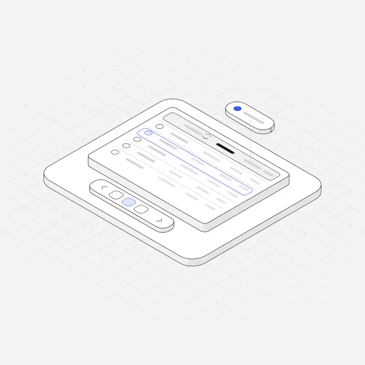
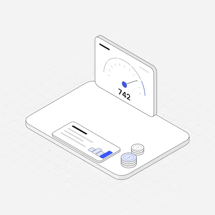
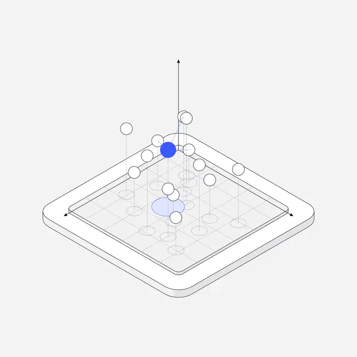
Job: explain ideas, signal sections, give the brand a look. Format: SVG. Tip: one style across the whole site, and draw your product's own nouns rather than generic rockets. See Illustrations for websites.
3. Photography
Job: show real people, places and physical products, and build trust. Format: WebP or AVIF with responsive srcset. Tip: real team and customer photos beat stock photos almost every time.
4. Product screenshots and mockups
Job: show exactly what people get. Format: WebP at 2x, or live HTML for interactive demos. Tip: crop to the part that matters and use real-looking data.
5. 3D renders
Job: premium hero moments and launches. Format: WebP/AVIF, or a lightweight 3D viewer. Tip: they are heavy and hard to recolour, so use them for one moment, not every section.
6. Charts and data visuals
Job: prove a claim with numbers. Format: SVG or a chart library. Tip: label directly on the chart and keep one accent colour for the number that matters.
7. Patterns, textures and motion
Job: atmosphere and emphasis. Format: CSS gradients, small SVG patterns, CSS or SVG animation. Tip: subtle beats busy, and always respect prefers-reduced-motion. See Animated SVG illustrations.
Which graphics for which page
| Page | Lead with | Support with |
|---|---|---|
| Home / landing | Screenshot or illustration | Feature illustrations, icons, one chart |
| Features | Illustrations per feature | Screenshots |
| About | Team photography | Illustrations for values or story |
| Blog | Header illustration | Diagrams, charts, screenshots |
| Docs | Diagrams | Icons, small illustrations |
| Empty, error, 404 | Small illustration | Icons |
Keeping website graphics consistent
- One illustration style and one icon set, with matching stroke weights. For thin-line styles see Hairline illustrations for UI/UX.
- One accent colour shared by buttons, icons and illustrations.
- Light and dark versions if your site has a dark theme.
- A shared radius and border for every framed image and card.
Liniqo covers the illustration layer: 2,049 hairline isometric graphics for websites, in one style, with your accent colour applied to every file. Browse the library; 308 are free.
Questions
What graphics does a website need?
Usually an icon set, one illustration style or product screenshots for explaining features, real photography for trust, and a few charts. Consistency across them matters more than quantity.
What is the best format for website graphics?
SVG for icons, illustrations and charts; WebP or AVIF for photos, screenshots and 3D renders.
Where can I find graphics for my website?
Icon sets and photo libraries cover icons and photography. For illustrations, Liniqo has 2,049 hairline isometric graphics, 308 of them free.