Blog / Design
Hairline illustrations for UI/UX design: the complete guide
Hairline illustrations use thin, even lines and very little fill. That restraint is exactly why they work inside interfaces: they explain without shouting. Here is how to choose, size, colour and place them in UI/UX design.
By Abdullah NomanOctober 13, 20265 min read
Most illustration styles were made for marketing: big, colourful, meant to be noticed. Interfaces need something else. A settings page, an empty table or an onboarding step needs a picture that helps for a second and then gets out of the way. Hairline illustration is the style built for that job.
What is a hairline illustration?
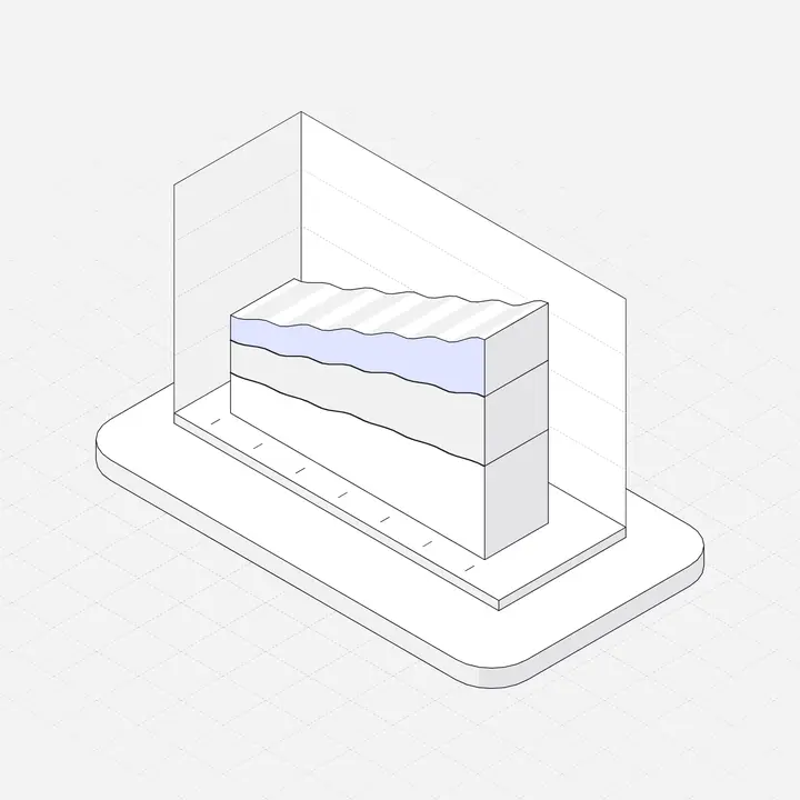
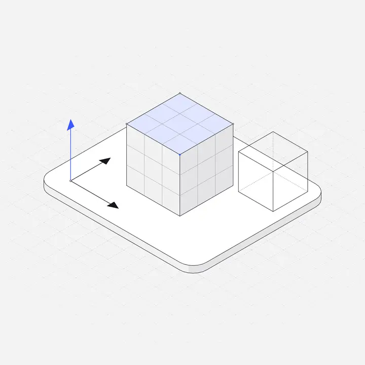
A hairline illustration is drawn with very thin, uniform strokes, about one pixel at its normal display size, with light or no fills and usually a single accent colour. Form comes from the lines, not from shading. Think of a technical drawing that has been simplified until it is friendly.
Three features separate hairline from ordinary line art:
- Uniform stroke. Every line is the same weight. No tapered brush strokes.
- Thin stroke. Close to the weight of the text and borders around it, so it reads as part of the UI.
- Restraint. Neutral surfaces and one accent, used on the part that matters.
Why hairline illustrations suit UI/UX
- They match interface details. UI is made of 1px borders, thin icons and type. A hairline drawing shares that visual weight, so it looks native rather than pasted on.
- They support the content instead of competing with it. A heavy, saturated illustration pulls the eye away from the button you want clicked. A hairline one points at it.
- They scale across moments. The same style works at 96px in a table's empty state and at 480px in a landing page hero.
- They theme cleanly. With few fills, swapping line and surface colours creates a convincing dark version.
- They age slowly. Restrained line work dates less than trend-driven gradients and characters.
Hairline vs other UI illustration styles
| Style | Strength | Weak spot in UI |
|---|---|---|
| Hairline | Calm, precise, theme-friendly | Can look faint if scaled very large or on low-contrast backgrounds |
| Flat colour | Friendly, bold | Competes with buttons and brand colours |
| Character-led | Emotional, human | Representation and consistency are hard across a whole app |
| 3D renders | Rich, eye-catching | Heavy files, hard to recolour, rarely have dark versions |
Hairline and isometric combine particularly well: the isometric grid gives depth and structure, the hairline stroke keeps it light. That is the style Liniqo is built on. If isometric is new to you, start with What is isometric illustration?
Getting the stroke weight right
The single most important detail. Match the illustration's stroke at display size to your UI:
- Check your icons. If your icon set uses a 1.5px stroke at 24px, illustrations whose lines render around 1 to 1.5px look like the same family.
- Mind scaling. An SVG's stroke scales with the drawing. A 1px line drawn on a 400px artboard becomes 0.5px at 200px and 2px at 800px. Use the illustration near its intended size, or pick one drawn for that size.
- Do not add non-scaling strokes blindly.
vector-effect: non-scaling-strokekeeps lines at a fixed weight, but small drawings then look heavy and large ones look sparse. It is a tool for icons, rarely for illustrations.
Sizing guide for common UI placements
| Placement | Width | Notes |
|---|---|---|
| Empty state in a card or table | 96 to 160 px | Keep the action button visible |
| Full-page empty or first-use state | 200 to 280 px | Above the headline |
| Onboarding step | 120 to 160 px | Beside or above the step title |
| Feature card on a landing page | 160 to 240 px | Same size on every card |
| Hero | 360 to 560 px | Check lines do not look faint |
| Modal or dialog | 80 to 120 px | Optional; never push buttons down |
Colour: neutrals plus one accent
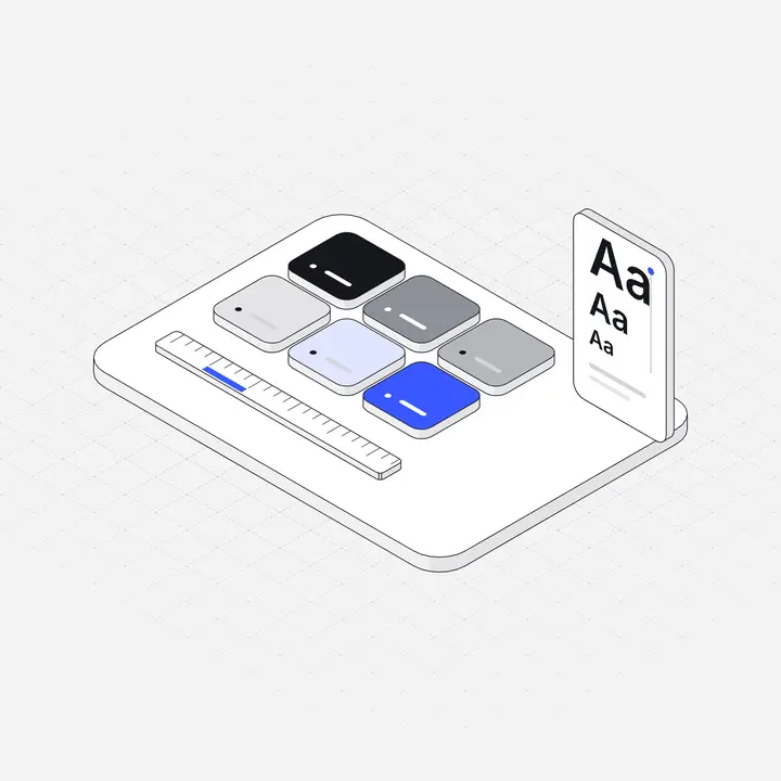
Hairline style depends on a disciplined palette. A robust setup for UI:
- Line colour close to your text colour, or a very dark tint of your brand.
- Surfaces in three or four light neutrals, slightly warmer or cooler to match your UI greys.
- One accent: your primary brand colour, used on the part of the drawing the screen is about.
When the illustration's accent matches the primary button below it, the eye travels from picture to action. That small connection is a big part of why a screen feels designed. Technique for changing colours in code is in How to recolour SVG illustrations.
Dark mode
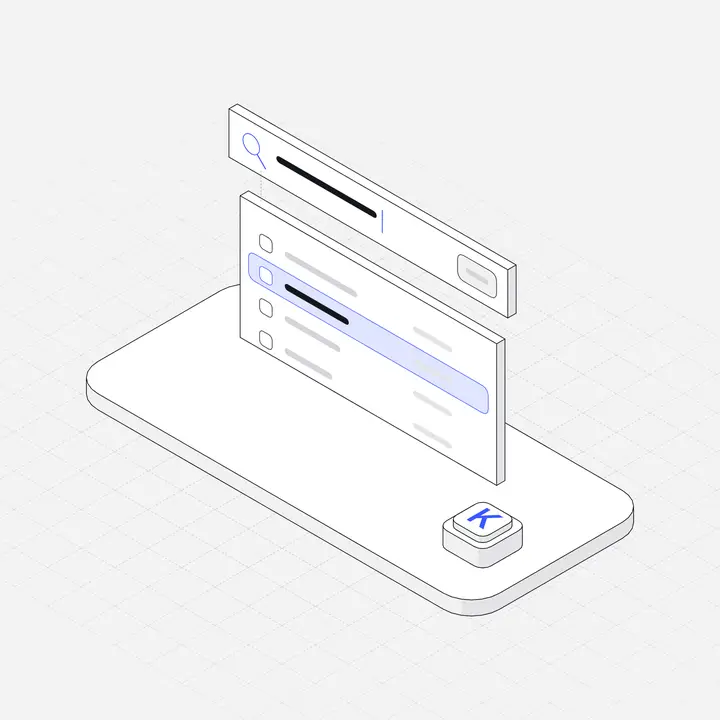
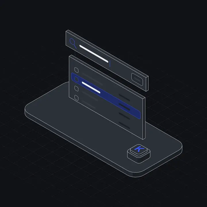
Hairline drawings convert to dark mode better than most styles, but only with a real dark version: light lines around #E8EAEE, surfaces a few steps above the background, and an accent lightened enough to keep contrast. Never ship the light file on a dark background. See Dark mode illustrations.
Where hairline illustrations help in a product
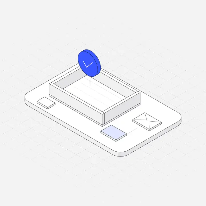
- Empty states: the most valuable place. See Empty state illustrations.
- Onboarding: one small drawing per step. See Illustrations in SaaS onboarding.
- Feature sections on the marketing site, so the site and app share a style.
- Settings and integrations pages, to make long lists scannable by topic.
- Success, error and 404 pages, where a quiet picture softens the moment.
- Docs and changelogs, as section markers.
Accessibility and performance
- Most UI illustrations are decorative:
alt=""oraria-hidden="true". Give meaningful ones a shortaria-label. - Thin light-grey lines can fail contrast for people with low vision. Keep main outlines dark enough to read clearly against the background.
- Hairline SVGs are small, often a few kilobytes. Still set width and height to avoid layout shift, and lazy-load below the fold.
- If you animate them, keep it short and respect
prefers-reduced-motion. See Animated SVG illustrations.
Using Liniqo for hairline UI illustrations
Liniqo is a library of 2,049 hairline isometric illustrations made for exactly these placements, drawn by one designer on one grid with one stroke weight, so empty states, onboarding, settings and landing pages all match. In practice:
- Set your accent and line colour once in the library; every preview and download follows.
- Download SVG in light or dark, or use the SVG's CSS variables to theme it in code.
- Install React components with the shadcn registry, with accent, theme and animation as props.
- Let Claude, Cursor or Lovable place illustrations for you over MCP. See AI tools.
308 illustrations are free for commercial use with no attribution, which is enough to try the style across a few real screens before deciding.
Questions
What is a hairline illustration?
An illustration drawn with thin, uniform strokes, about one pixel at display size, with light or no fills and usually one accent colour.
Why use hairline illustrations in UI/UX design?
They share the visual weight of UI borders, icons and text, so they look native in an interface, support the content instead of competing with it, and theme cleanly for dark mode.
What stroke weight should UI illustrations use?
Match your icon set at display size, typically lines rendering around 1 to 1.5px. Use illustrations near their intended size, since SVG strokes scale with the drawing.
Where can I get hairline illustrations for UI?
Liniqo has 2,049 hairline isometric illustrations for UI/UX, with 308 free and no attribution. Our roundup of hairline libraries lists other options too.