Blog / Guides
Isometric illustration styles: hairline, flat, gradient and 3D compared
"Isometric" describes the angle, not the look. The same isometric server rack can be a few thin lines or a glossy 3D render. Here are the four common isometric illustration styles and how to choose.
By Abdullah NomanOctober 13, 20263 min read
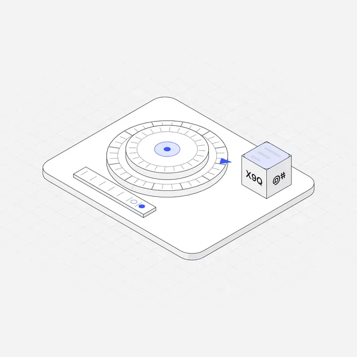
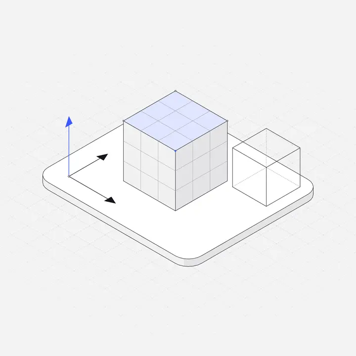
Every isometric illustration shares one rule: three axes, 120 degrees apart, no perspective. Within that rule there is a lot of room. These four styles cover almost everything you will see on product sites.
1. Hairline isometric
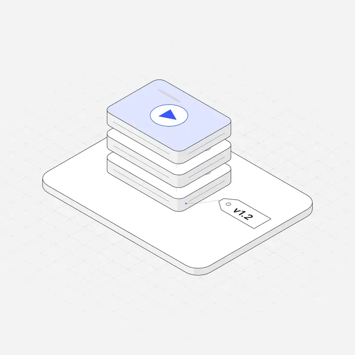
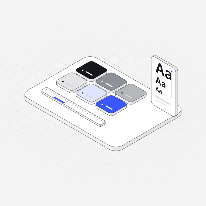
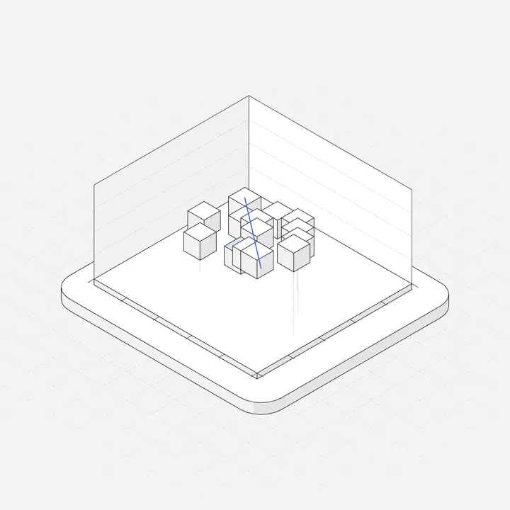
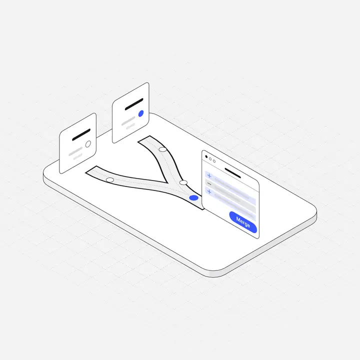
Thin, uniform outlines with light neutral surfaces and one accent colour. It reads as calm and precise and sits naturally next to UI, so it works across a whole product: empty states, onboarding, docs and marketing. It is also the easiest style to recolour and to adapt for dark mode. This is the style Liniqo is drawn in.
2. Flat colour isometric
Solid fills in a few brand colours, often with no outlines. Bold and friendly, very readable at small sizes, and common in infographics. The risk is competition with your UI: strong fills can outshine buttons and charts.
3. Gradient isometric
Fills with gradients and soft shadows, popular in fintech and crypto marketing. Looks rich in a hero, but gradients are harder to recolour consistently, date quickly and often look muddy at small sizes or in dark mode.
4. 3D-rendered isometric
Made in a 3D tool with an orthographic camera, with real lighting and materials. The most premium look, and the heaviest: raster files, hard to recolour, rarely available in dark versions. Best kept for one or two hero moments.
Side by side
| Hairline | Flat | Gradient | 3D | |
|---|---|---|---|---|
| Feel | Calm, precise | Bold, friendly | Rich, glossy | Premium, realistic |
| File size | Very small SVG | Small SVG | Medium SVG | Large raster |
| Recolouring | Easy | Easy | Hard | Very hard |
| Dark mode | Easy | Medium | Hard | Hard |
| Inside product UI | Excellent | Good | Fair | Poor |
| Hero impact | Good | Good | Very good | Excellent |
How to choose
- If illustrations will live inside your product (empty states, onboarding, settings), choose hairline or flat. They stay readable and light.
- If they are only for one marketing page, any style works; gradient and 3D give the most impact.
- If you have a dark theme, hairline is the easiest to support well.
- Whatever you pick, do not mix styles on the same screens.
More on the thin-line approach in Hairline illustrations for UI/UX design, and the geometry itself in What is isometric illustration?

Questions
What are the main isometric illustration styles?
Hairline (thin outlines, light fills), flat colour, gradient, and 3D-rendered. They share the isometric angle but differ in line, fill and lighting.
Which isometric style is best for SaaS products?
Hairline or flat, because they stay readable at small sizes, recolour easily and work inside product UI as well as on the marketing site.
Is 3D isometric better than vector isometric?
Not generally. 3D looks premium in a hero but is heavy, hard to recolour and rarely has dark versions. Vector styles are more practical for products.