Blog / UX
Success states and confirmation screens: how to design them
The moment after someone finishes a task is when they are happiest with your product. A good success state confirms what happened and points to the next useful thing.
By Abdullah NomanNovember 5, 20263 min read
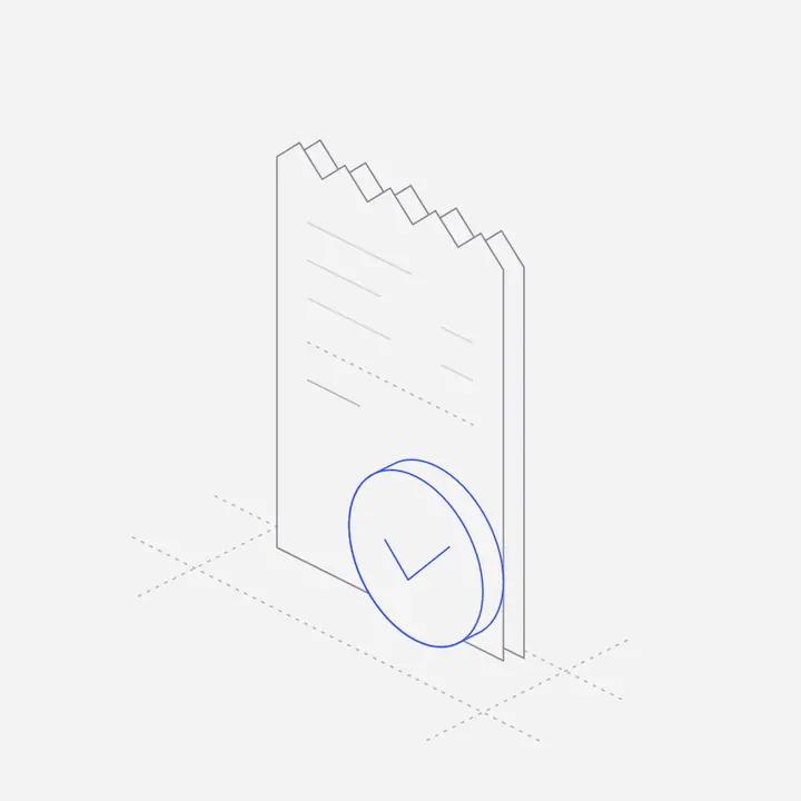
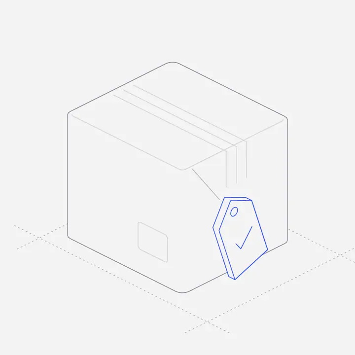
Short answer: confirm exactly what happened, with the details the person will want to check (amount, email address, date and time), then give one clear next step. Use a small illustration or icon to make the moment feel finished, and save big celebrations for real milestones, not routine saves.
What should a success screen confirm?
| Moment | Confirm | Next step |
|---|---|---|
| Payment complete | Amount, plan, receipt sent to which email | Go to the product |
| Order placed | Order number, delivery estimate | Track the order |
| Email verified | Which address is now verified | Continue setup |
| Booking confirmed | Date, time and time zone | Add to calendar |
| Upload complete | File name and where it went | Share or open it |
| Password updated | That other sessions were signed out, if they were | Back to account |
When should a success state be a full page, and when a toast?
- Full page for the end of a flow: checkout, sign-up, verification, booking. The person needs the details and a next step.
- Inline message for something in context: "Changes saved" under a form.
- Toast for quick, reversible actions: archived, copied, moved. Offer Undo.
Should you celebrate with confetti?
Only when the user achieved something: a first project published, a goal reached, a level up. Celebrating every save makes the product feel noisy and the real milestones less special. A calm check or a small illustration fits routine success.
What should a success screen not do?
- Leave the person at a dead end with no way forward.
- Ask for a review or an upgrade before confirming what happened.
- Hide the receipt or reference number.
- Disappear before it can be read, for anything involving money.
Where can you get success and confirmation illustrations?
Liniqo’s Success States pack has 25 scenes, from payment complete and email verified to booking confirmed and level up, and the pre-built pages include confirmation and email-verified pages ready to paste.
Questions
What should a payment success page include?
The amount, the plan or items, where the receipt was sent, and a button to continue into the product.
Should success messages disappear automatically?
Short toasts for reversible actions can. Anything involving money, bookings or account changes should stay until dismissed.
What is the difference between a success state and an empty state?
A success state confirms a finished action; an empty state appears when there is nothing to show yet and suggests a first action.
Do success screens need illustrations?
Not always, but a small figure makes the end of an important flow feel finished and on-brand.